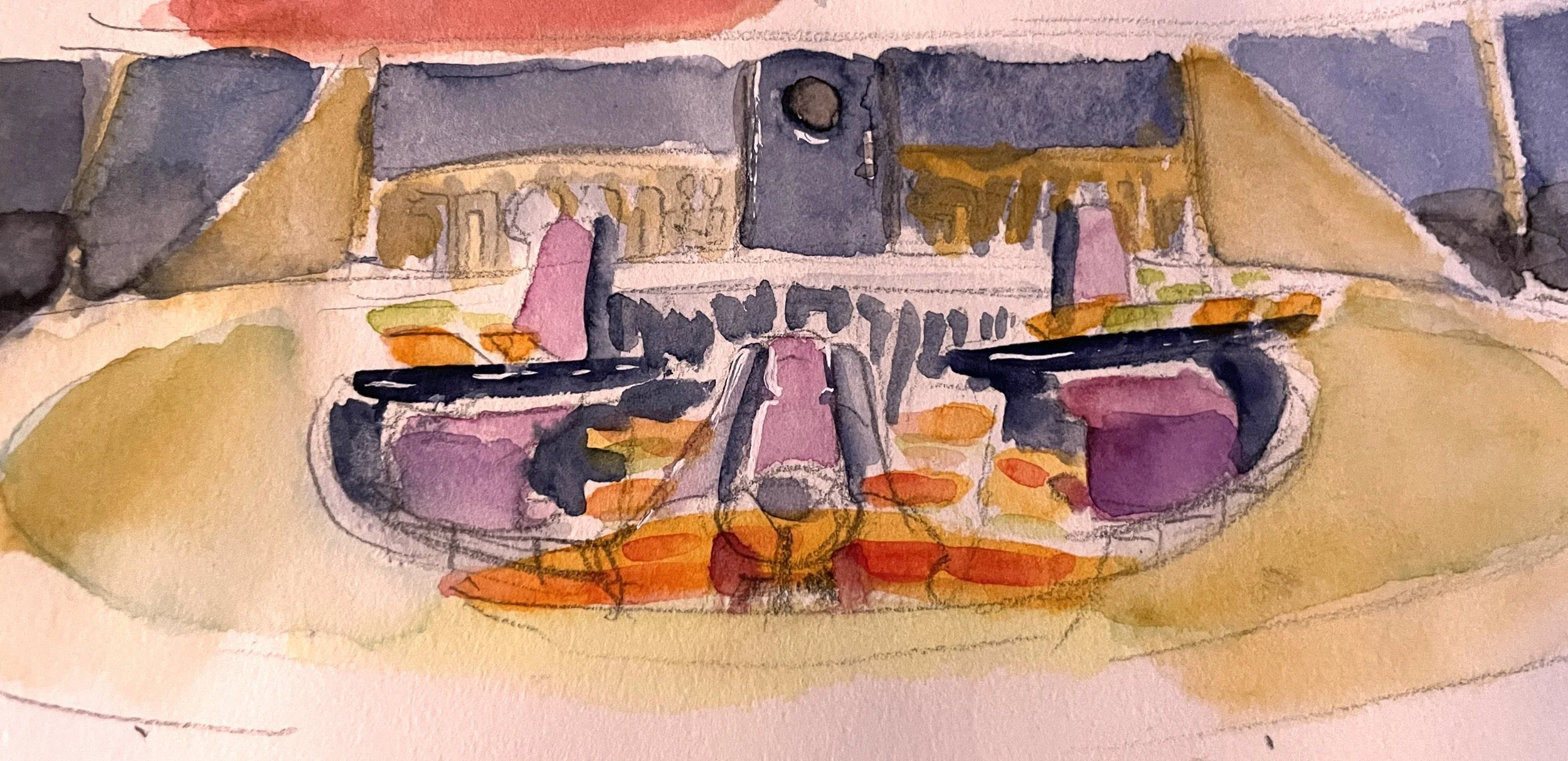
So what does a laser yacht look like on the inside? I did some watercolor exploration to find out.
I’m mostly focused on the Captain’s Seat on the bridge, because that’s where most of the dramatic focus is for the scenes in the pilot. A lot of important stuff happens there. Certain fixtures like doorways had to be placed purposefully.


I love the idea of the User Interface being this searing orange that burns your eyes. Like what if someone made a Virtual Boy even more horrible for your eyes? My animation partner even suggested adding a game controller to drive home that hunting is a game to these teenagers. They raze the oceans without feeling any real consequences to themselves…

Until the surfers show up of course.
I feel like gold interiors are working best so far. Gold makes everything feel luxurious and sick at the same time. Gold is a good “alert” color too, so it works out.


I also tried this one painting of silver fixtures with the yellow interface. I don’t know if I’m into it, but I like the contrast.
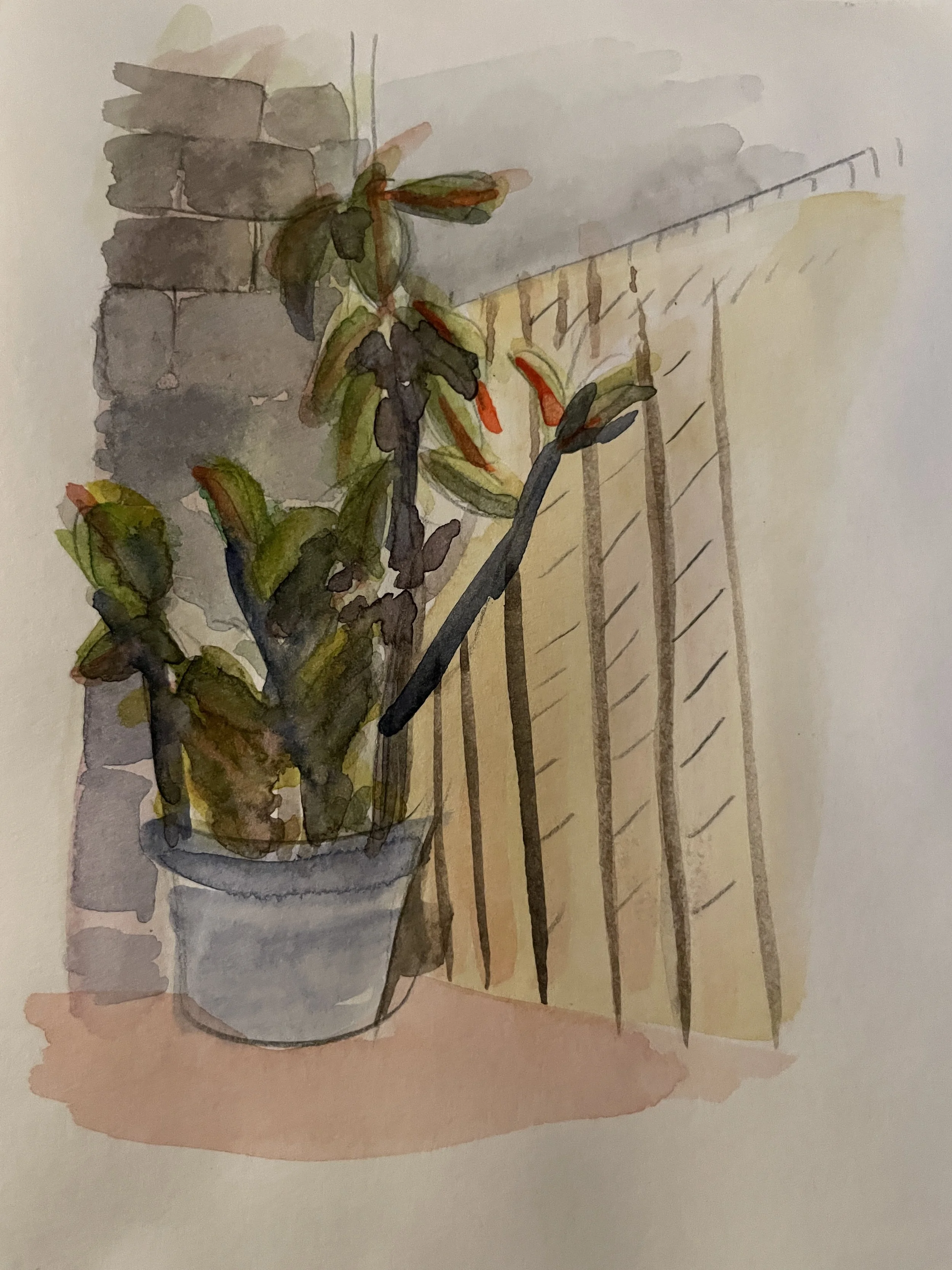
I also made a painting of a nearby rubber tree plant because it looked neat.
Hey, sometimes you have to do art for fun too.
Happy Trails,
-Jules